Check the acquisition promise
Read the store headline, screenshots and description. What problem is the app promising to solve?
Study the storefront ↗
Gallup, Inc. · iOS
Explore the ad evidence, study the storefront, and build your next acquisition hypothesis.
01 / Creative research
Read the store headline, screenshots and description. What problem is the app promising to solve?
Study the storefront ↗Explore apps with direct store-link matches. Compare their hooks and formats without assuming the same approach works here.
Browse observed advertisers ↗Store rankings and revenue estimates describe market context. They do not establish ad spend, conversions or ROAS.
Review the market context ↗02 / Storefront & product
Study the product story and store experience behind the acquisition funnel.

03 / Market context
Keep revenue, downloads and store rankings separate from advertising performance.
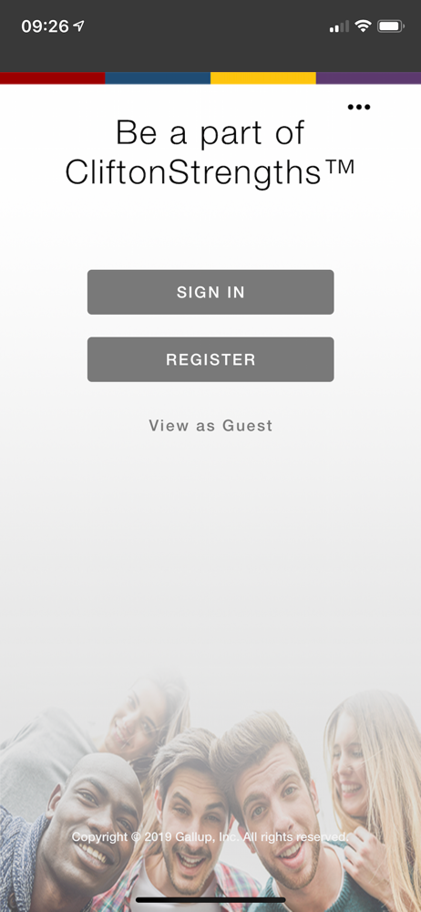
I have had difficulty getting on parent Lee there are several user names associated with my name. I have taken the strengths finders assessment as well as the BP 10. I want them all consolidated under one user name and I have requested this. Last time I called in I spoke with the young man who told me he didn’t know anything about the app. So the app is kind of unusable for me at this point. I have requested whatever is out there under my name be consolidated under one user name.
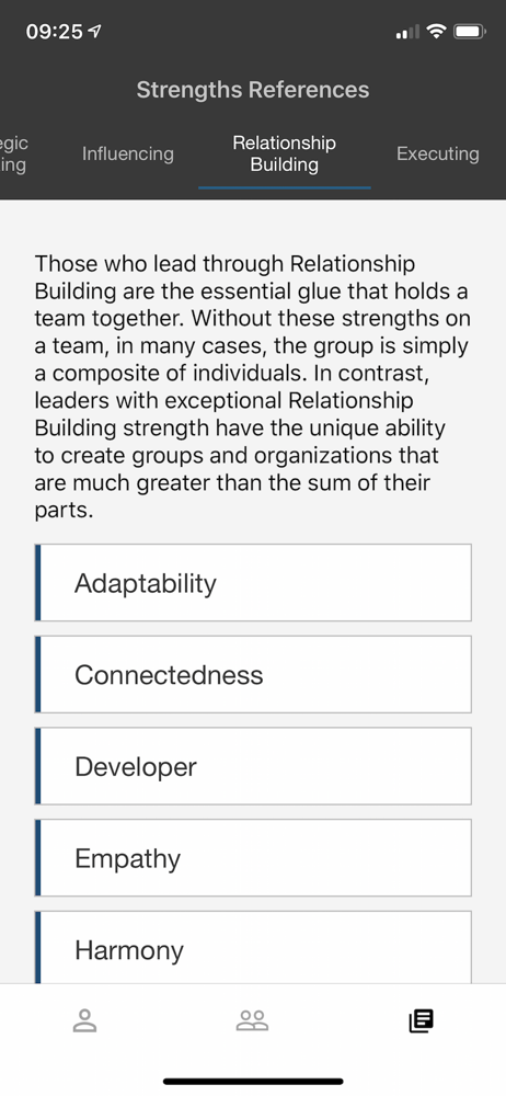
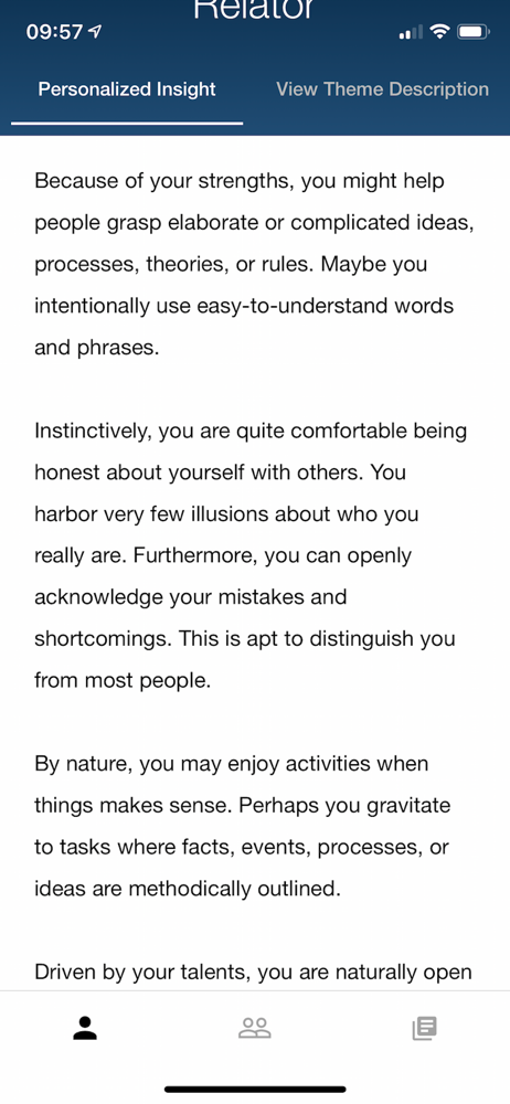
Two things: 1-the color domain bands are too thin so difficult to see. 2-the sharing feature is worthless as the contact you try to share with has to have an account to share. So then, I have to wait to get on a computer and send my PDF report. Stupid and time consuming. Clifton, if you would allow us to share to ANY contact, you could then mkt this wonderful assessment to those who have not yet purchased it themselves. Clifton would get more sales. Get with the times in the sharing economy!
The font size is smaller than it should be on my iPhone X. Perhaps utilize landscape format? Add a back button. There is only a next button. On a few questions I wanted to change my answer after a bit more reflection but couldn’t because there is a question timer. So now I paid $50 or inaccurate results because I couldn’t correct my answer. That’s just bad UI/UX. On my talent ranking page, I can’t really tell the different between the blue and purple colors. Use more contrasty colors, or shoe more than a sliver of color so I can better understand by high and low ranking domains.
16+ MILLION PEOPLE have discovered their strengths, and now you can too! Use StrengthsFinder to discover your CliftonStrengths and understand how to...
| Name | Price | Type |
|---|---|---|
| Top 5 Strengths | $19.99 | One-time |
| CliftonStrengths 34 Upgrade | $39.99 | One-time |
| CliftonStrengths 34 | $49.99 | One-time |