Check the acquisition promise
Read the store headline, screenshots and description. What problem is the app promising to solve?
Study the storefront ↗
Youssef Ismaili · iOS
Explore the ad evidence, study the storefront, and build your next acquisition hypothesis.
01 / Creative research
Read the store headline, screenshots and description. What problem is the app promising to solve?
Study the storefront ↗Explore apps with direct store-link matches. Compare their hooks and formats without assuming the same approach works here.
Browse observed advertisers ↗Store rankings and revenue estimates describe market context. They do not establish ad spend, conversions or ROAS.
Review the market context ↗02 / Storefront & product
Study the product story and store experience behind the acquisition funnel.




03 / Market context
Keep revenue, downloads and store rankings separate from advertising performance.
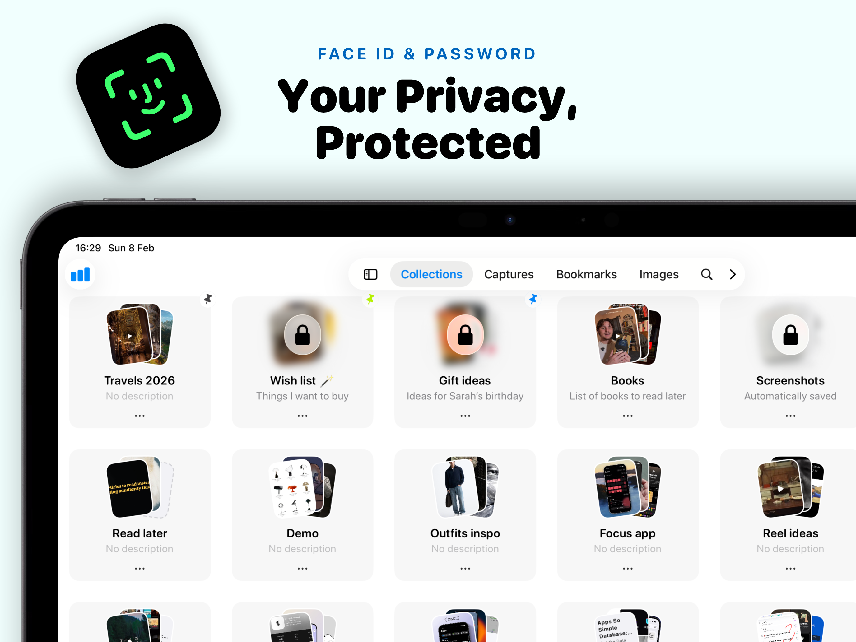
This app is worth every penny you spend. It was already a very useful and beautiful app, but in recent updates, it has become much smoother and faster. Now, with the ability to categorize screenshots, and also the addition of the Mac version, I think everyone should have this app on their device.
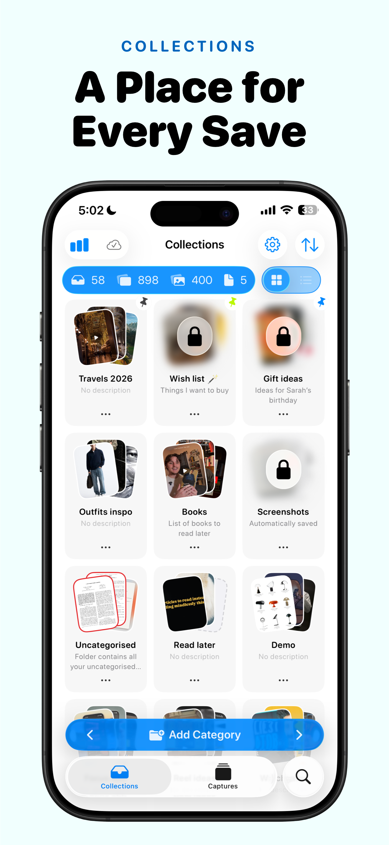
This has the potential to be my preferred bookmark manager. There are a few annoyances I’d like to see resolved to put it firmly over the top. The UI is too “deep”, meaning it takes too long to get past the metadata to the content. Once I’ve drilled into a collection, I’d like to tap once to start reading, but instead I get the summary / caption screen and I have to tap again to get to the actual page. Related: it would be nice to have both “open link” AND “open in browser” in the context menu to bypass the reader entirely for sites I know to be badly behaved in the in-app browser / reader (which is usually fine, and I’d prefer to stay in-app when it works, and not have to drill all the way down when it doesn’t). I appreciate the configurability of the collection contents and captures views because I like lots of rows visible at once (so the “Compressed” view is great). I’d like to see that on the Collections view as well. I don’t care for the “3 item fan” icon, it’s not particularly useful and takes up way too much space. I only see 4 rows on my iPhone screen, and a truncated name and description in the tiny horizontal space allocated to them. I’d prefer being able to select an icon from one of the great open source icon collections out there so the “Compressed” row of the Collections view would have more room for item name and description. The “Compact” and “Compressed” rows could trade off 2 and 1 line descriptions to increase the number of collections on screen at once. Finally, when I installed the app on iPad after running on iPhone, it created a second “Uncategorised” collection, and new uncategorized captures on the iPhone go into one while captures on iPad go into the other (unless I tap the button that shows all collections and then guess which is which). Extremely minor quibble: let me edit the “Uncategorised” collection so I can use the American spelling of “Uncategorized” 😜. Apologies for the novel, but it’s an indication of how much I like the app that I took the time!
As a content creator, and just a person who loves photos and keeping things organized, this is the best thing since ice cream was invented because I can categorize all my photos and screenshots without having to go nuts, trying to find them very, very, very useful tool highly recommend Can’t wait for an update for the video feature and then this app would be a freaking 10 out 10 for me
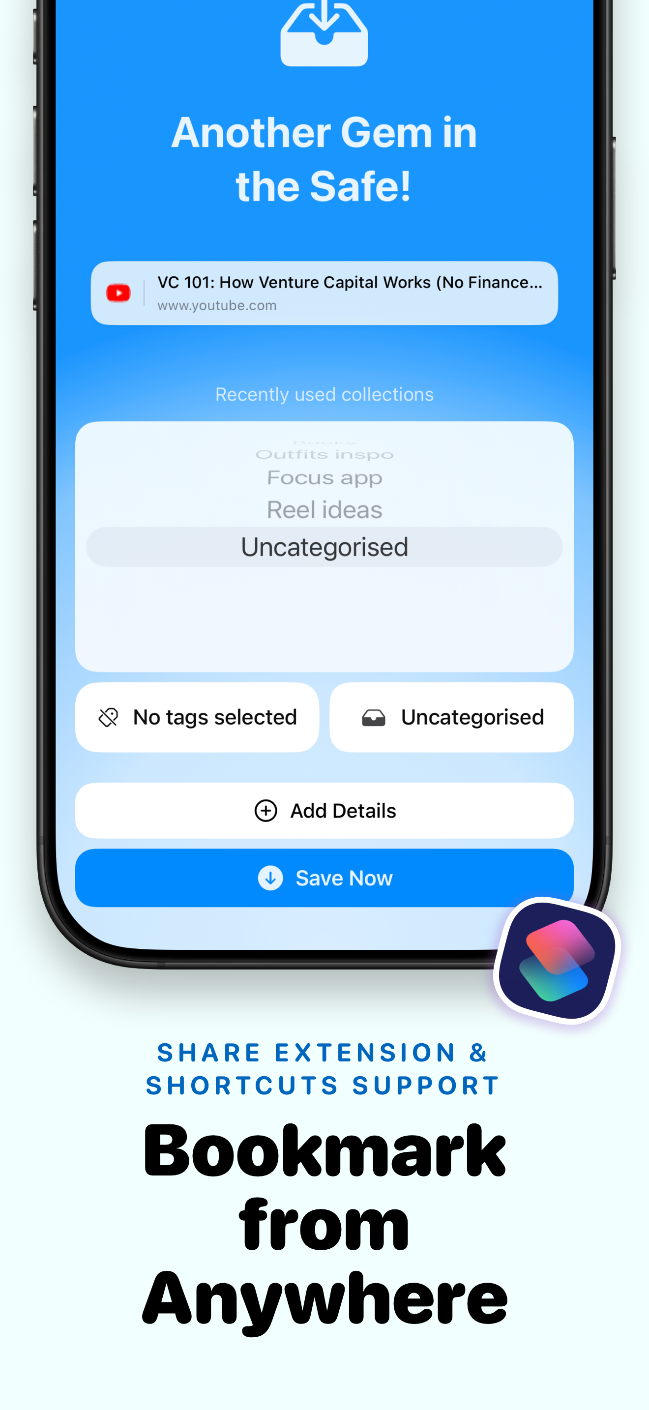
Save articles, screenshots, PDFs, and links from any app -- then read them later, even offline. Trace is the bookmark manager for people who save a lo...
| Name | Price | Type |
|---|---|---|
| Prismoria Monthly Premium | $2.99 | Monthly |
| Trace Pro Yearly | $9.99 | Yearly |
| Trace Pro (Annual) | $19.99 | Yearly |
| Trace Pro Lifetime | $19.99 | One-time |
| Trace Lifetime | $39.99 | One-time |