
Check the acquisition promise
Read the store headline, screenshots and description. What problem is the app promising to solve?
Study the storefront ↗
Regional Power Corporation · iOS
Explore the ad evidence, study the storefront, and build your next acquisition hypothesis.
01 / Creative research
Read the store headline, screenshots and description. What problem is the app promising to solve?
Study the storefront ↗Explore apps with direct store-link matches. Compare their hooks and formats without assuming the same approach works here.
Browse observed advertisers ↗Store rankings and revenue estimates describe market context. They do not establish ad spend, conversions or ROAS.
Review the market context ↗02 / Storefront & product
Study the product story and store experience behind the acquisition funnel.




03 / Market context
Keep revenue, downloads and store rankings separate from advertising performance.
Update: the recent update looks like the new app has gained a bit more usefulness but still very inconvenient having to log in regularly and being timed out. Please have the next release included face ID/biometric login at least. Still not as good as the old app but I’ll change from 1 to 2 stars. ——————— The old app was heaps better. Having to log in (slowly and inefficiently) every time (with timeouts too) is ridiculous for a modern app. Not only that, today when I open the app to check my usage, I can’t because HP says “MyAccount is currently offline”! So it doesn’t provide the necessary tool to monitor power usage 24x7. Luckily I still have the old app and can use that - with no issues and does what we need it to do. Bring it back!
Agree with the previous reviewer. The old app was way more functional. This app has a lag when moving around it and you need to re log in several times while using. The useage data has gone backward. It’s now a line chart rather than a bar chart so you can no longer clearly see what your useage is hour by hour. Also you can no longer see the current day useage. I want to be able to see what I’ve just used in the past hour after turning my air cons on for example. I don’t want to have to export data to find out my useage. The bar chart breakdown for solar grid and battery useage has colours that are too similar particularly the blue so it’s hard to see which on is which. Not sure why this app has regressed so much. Needs some major improvements. Happy to discuss with developers.
Why did they get rid of the previous app? It was great. This one requires a long login process every single time. It glitches. Trying get in a monitor the usage is a total headache nevermind the rest of it. They took a good accessible app and made one that I’d rather delete then use.
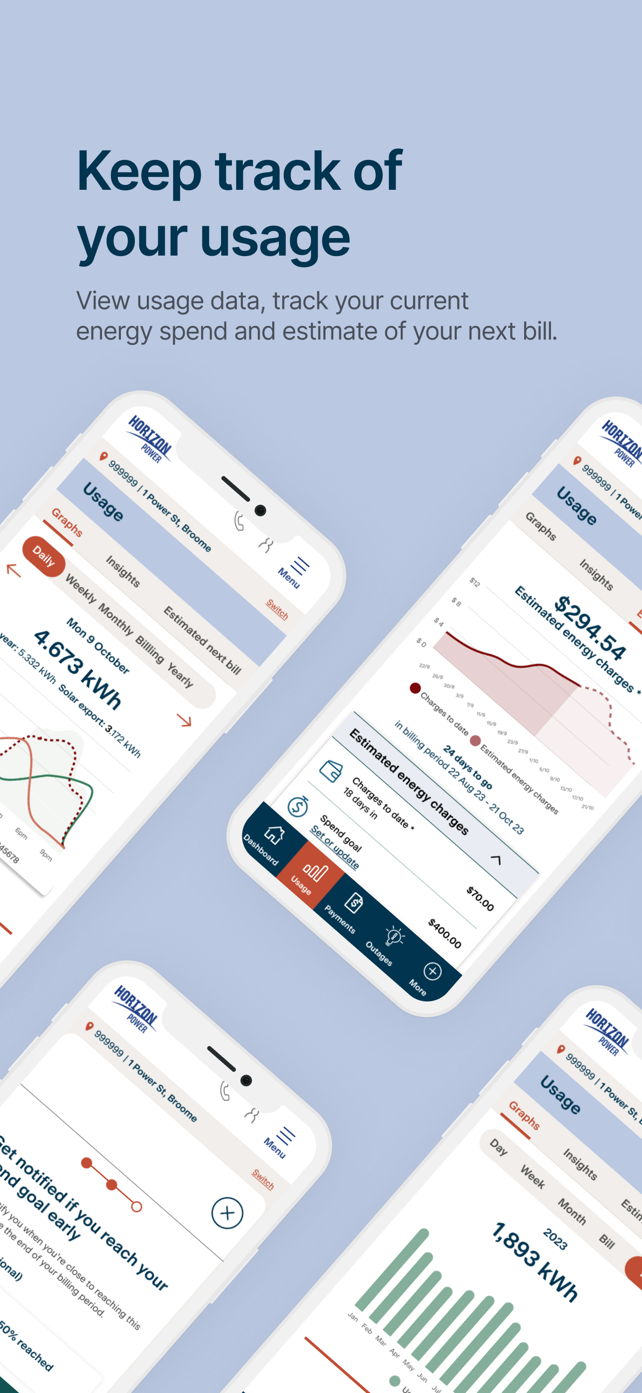
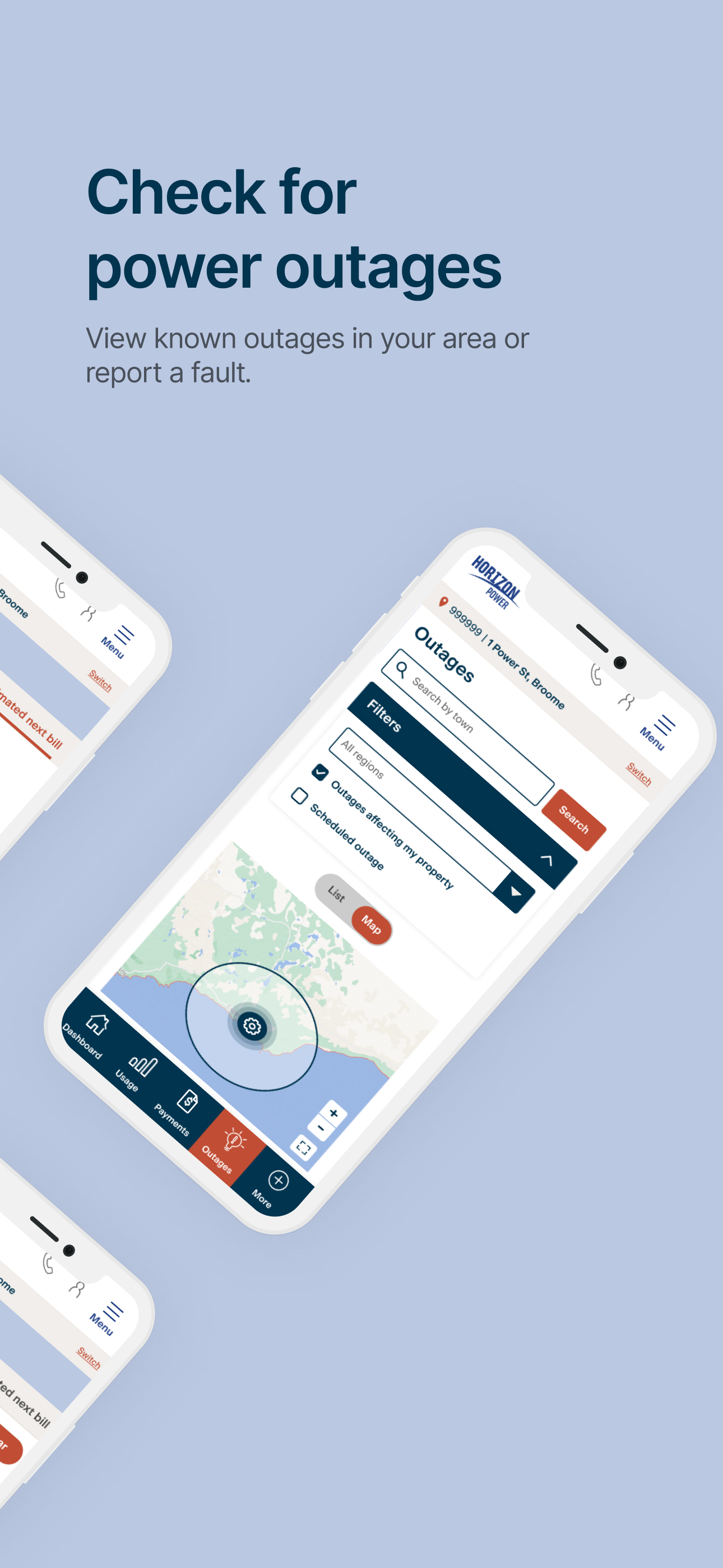
Break free from bill anxiety with MyAccount – the easiest way to track, manage and view your energy use. You can: - Check your account status - Tr...


