
Check the acquisition promise
Read the store headline, screenshots and description. What problem is the app promising to solve?
Study the storefront ↗
Filip Ruzicka · iOS
Explore the ad evidence, study the storefront, and build your next acquisition hypothesis.
01 / Creative research
Read the store headline, screenshots and description. What problem is the app promising to solve?
Study the storefront ↗Explore apps with direct store-link matches. Compare their hooks and formats without assuming the same approach works here.
Browse observed advertisers ↗Store rankings and revenue estimates describe market context. They do not establish ad spend, conversions or ROAS.
Review the market context ↗02 / Storefront & product
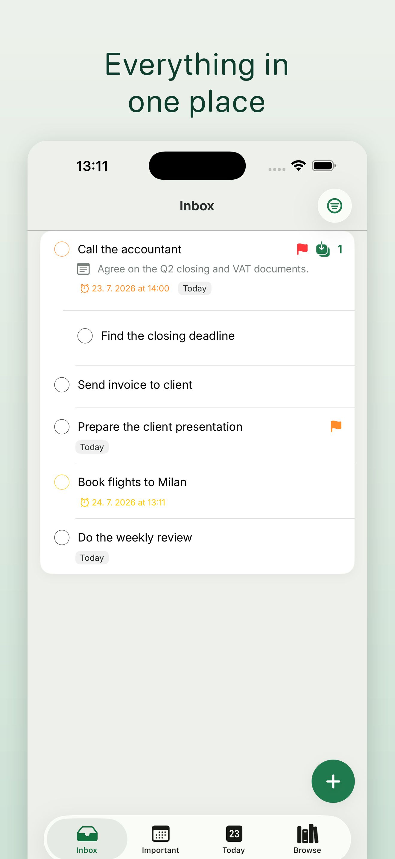
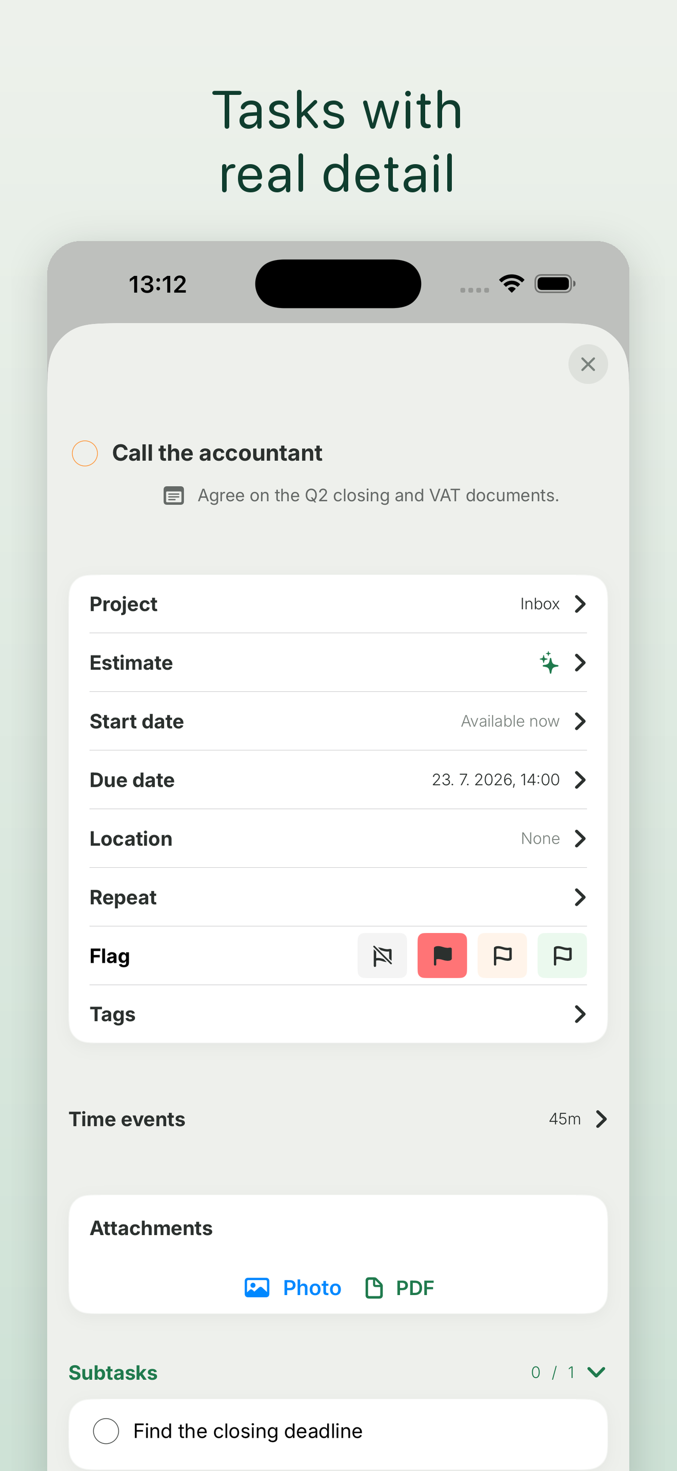
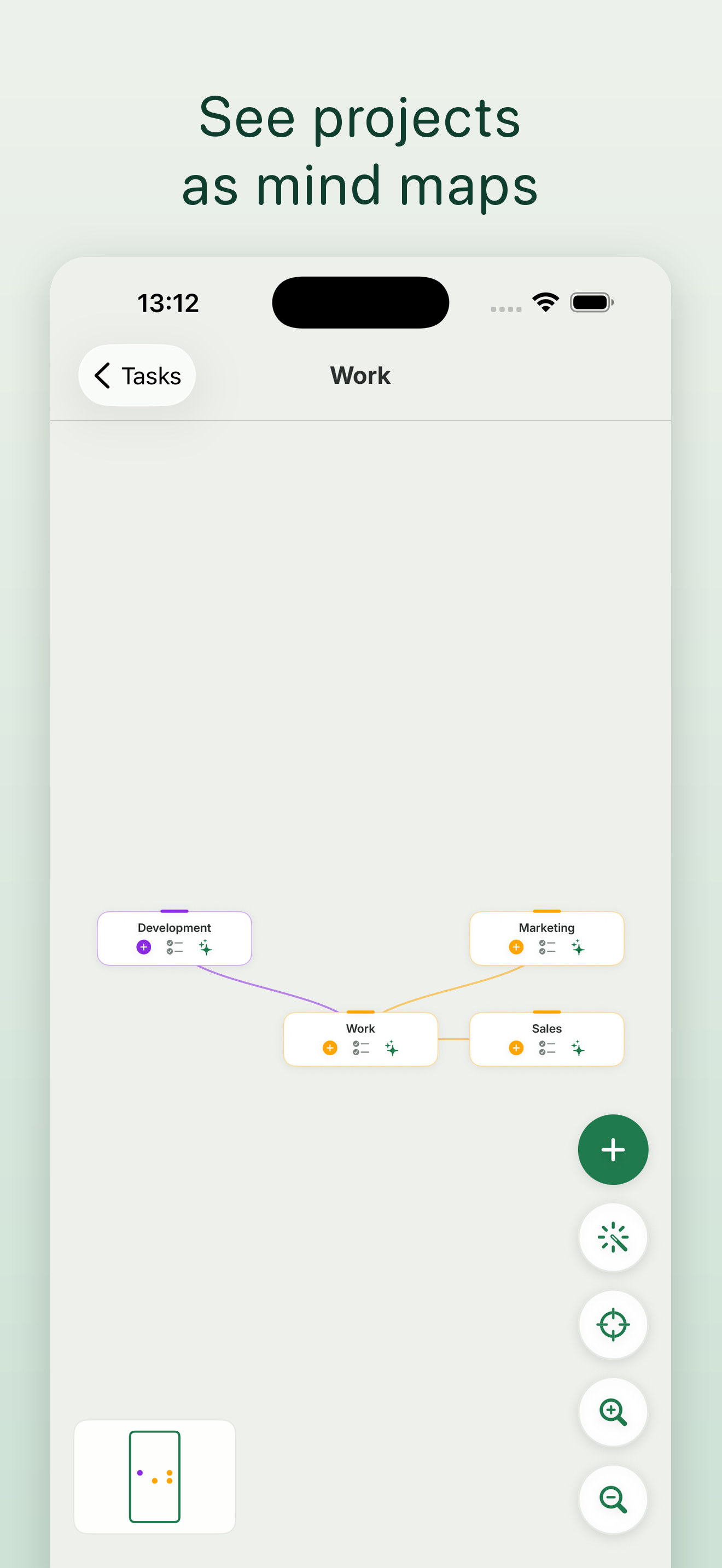
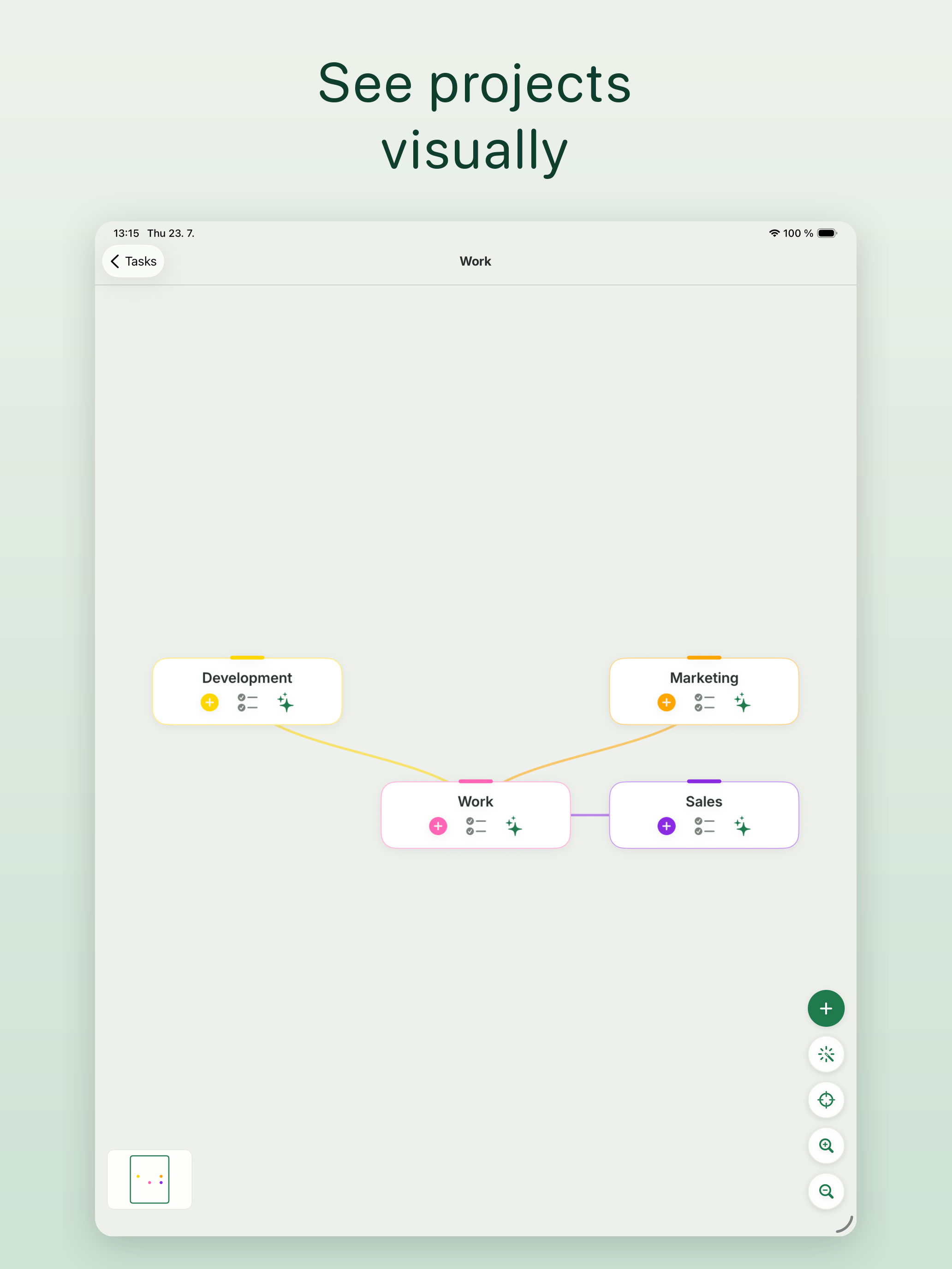
Study the product story and store experience behind the acquisition funnel.




03 / Market context
Keep revenue, downloads and store rankings separate from advertising performance.
The app description says that all synchronization is through iCloud and no login is required; but as soon as you launch the app, you must create an account to login. I will update this rating and review if the app is intended to not require a login and that requirement is removed in a subsequent update. If the login requirement remains, I will remove this rating and remove when the app description is updated accordingly. Also, the privacy policy could include some details about Usage and Diagnostics data is being collected (and through what means/tools).
I tried to post a review twice before but didn’t appear. Let’s hope this sticks. I like what you’ve come up with. Some of the new changes are good since 2.0 but the last one is not ideal for me. You changed the nice layout with the flagged tasks appearing in the today view. Now every task has to be timed and the create button is buried at the bottom. It’s much more cumbersome to simply add a task for the day. And the time estimate on the left is truncated so it doesn’t look right. Estimates is a nice option but not every task needs to have a time associated with it. Like for a simple shopping list. And any task you want to do but aren’t concerned with a time. Micromanaging yourself to that level of adding a time estimate to every task is daunting and leads to a feeling of overwhelm. I realize you are experimenting with the interface. Please consider this feedback constructive and hopefully help you in molding the ideal interface into a balance of form and function. Also on the Apple Watch app there’s an Urgent category. I don’t even know what that is for as there’s nothing in the iPhone version that has an urgency setting. To be honest I would do away with the word urgent all together — it is anxiety producing. Nothing in your todo list planner should be urgent IMO — a label for High priority would suffice if the flagged label is not enough. Lastly you have no contact support link or email that we can send feedback. Not everyone uses Twitter. If you really want to connect to your supporters you need an easy way to contact you. Keep up the good work and thank you for the lifetime option.
I was really excited I discovered this app because it blends mind mapping with task management - which feels like a more flexible way to manage my time. But unfortunately, I tested all of the buttons on desktop and couldn’t figure out how to use the mind mapping feature. It wasn’t easily visible to me. Apologies if this is an oversight on my end and I missed something, but apart from this issue this seems to be a very promising app.
Traguardo is a calm, focused planner that helps you plan less and finish more. Capture anything in plain language, let AI organize it, and let auto-s...
| Name | Price | Type |
|---|---|---|
| Month subscription | $3.99 | Monthly |
| Lifetime - No subscription | $19.99 | One-time |
| Year subscription | $29.99 | Yearly |


