
Check the acquisition promise
Read the store headline, screenshots and description. What problem is the app promising to solve?
Study the storefront ↗
University of Georgia Research Foundation, Inc. · iOS
Explore the ad evidence, study the storefront, and build your next acquisition hypothesis.
01 / Creative research
Read the store headline, screenshots and description. What problem is the app promising to solve?
Study the storefront ↗Explore apps with direct store-link matches. Compare their hooks and formats without assuming the same approach works here.
Browse observed advertisers ↗Store rankings and revenue estimates describe market context. They do not establish ad spend, conversions or ROAS.
Review the market context ↗02 / Storefront & product
Study the product story and store experience behind the acquisition funnel.


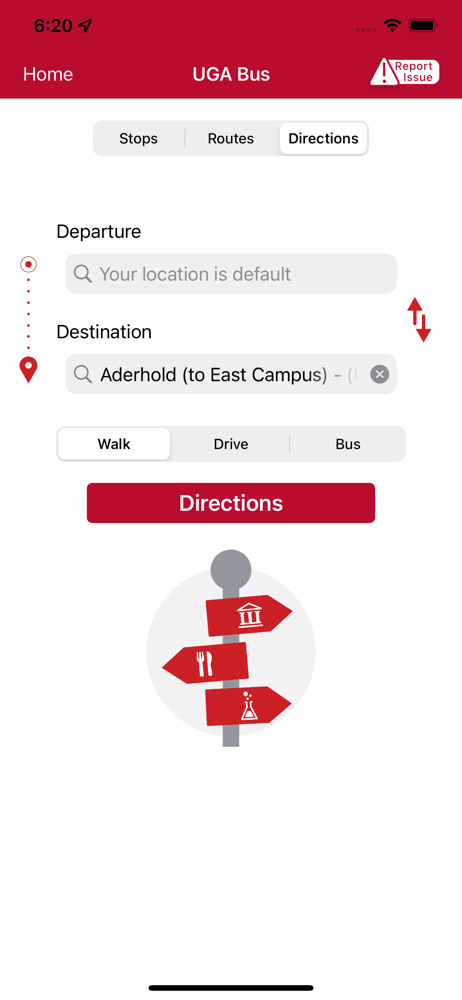


03 / Market context
Keep revenue, downloads and store rankings separate from advertising performance.
The app used to reliably track buses (though they were always a few minutes behind the expected arrival). Now, it often displays all routes as inactive. Even when correctly displayed as active, buses rarely appear on the map. This bug persists after multiple relaunches of the app. It’s also annoying that the interface to select/deselect certain routes for viewing has been moved from the upper right corner, and integrated into the bus stops’ interaction pages. It’s a headache to navigate. At least the app doesn’t crash every other time you open it anymore.
The new folder based design is horrible for one handed use. While the recently used folder brings some features down the screen for better one handed reach ability, the old design I can just tap the bus icon at the bottom and I don’t have to stretch my finger and I can track the bus. Now, I have to stretch my finger all the way to the top of the screen, horrible for one handed use. If you pin your favorites, it goes even further up the screen making it impossible to use this app one handed. Horrible app design! They need to conduct user experience research before pushing new app designs. Bring back the bottom navigation at least please!
The app is very jumpy; it’s not smooth at all. It does work for the bus stops and their routes which is primarily what I use it for. I tried using it to access Athena and ELC but it doesn’t remember my ID which makes it a hassle to use. Every time I login it links me to the login, then my settings that say they’ll remember my ID when I login. If this feature worked, I might use the app a lot more.
The UGA Mobile App is the best of the Bulldog Nation in one, central mobile app for students, visitors, parents, faculty, staff and fans. It’s the off...


