
Check the acquisition promise
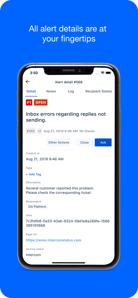
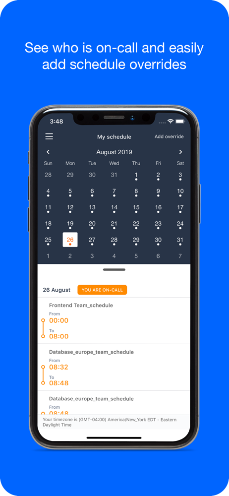
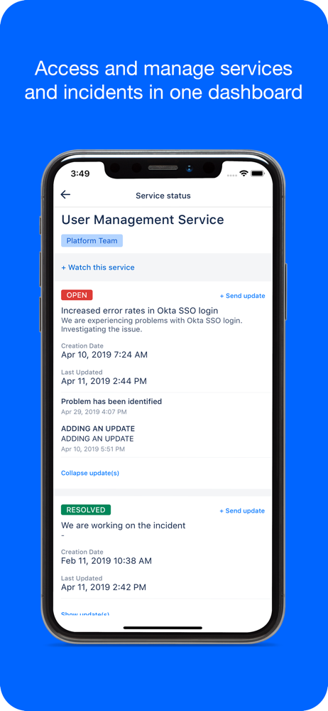
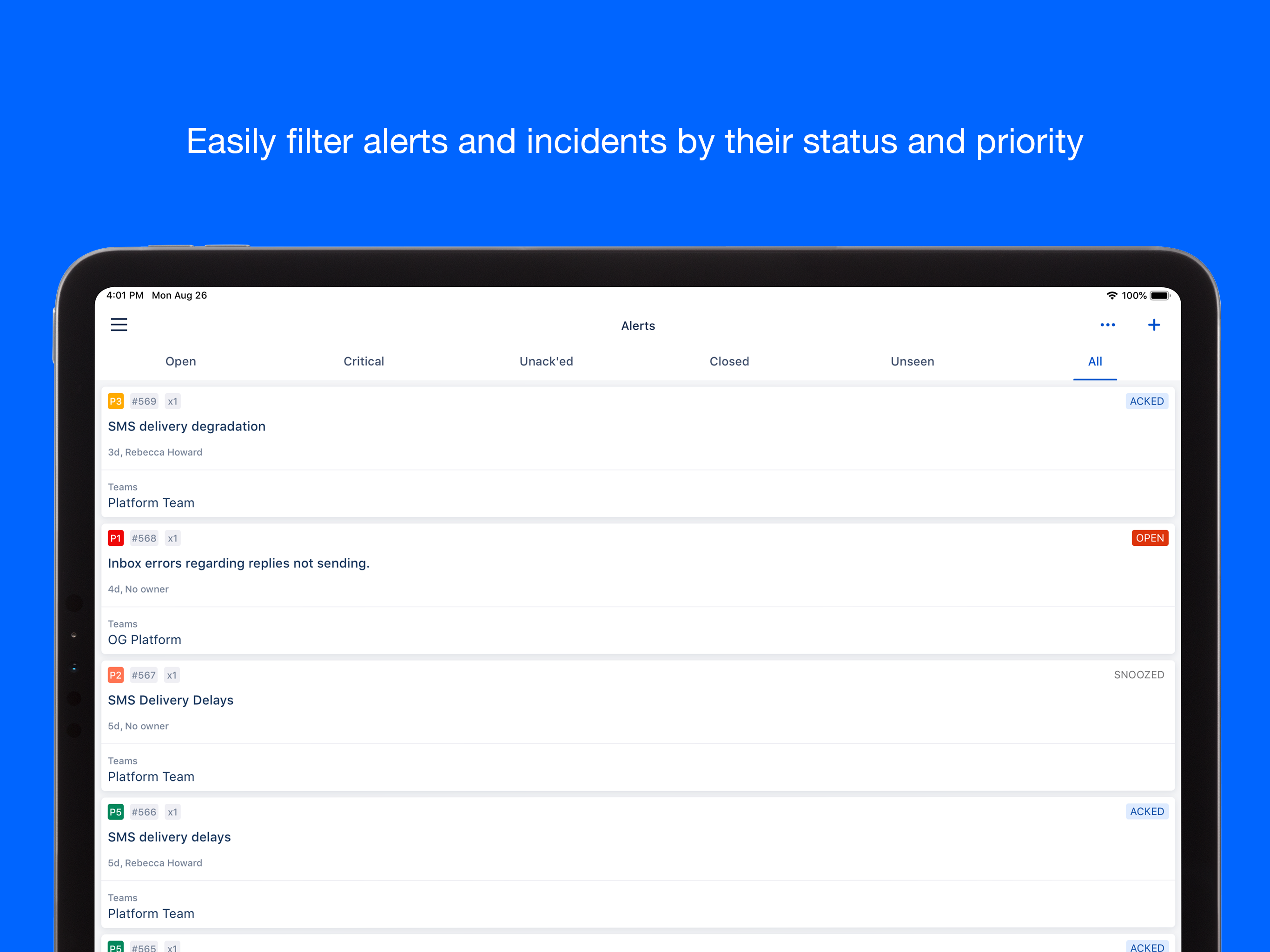
Read the store headline, screenshots and description. What problem is the app promising to solve?
Study the storefront ↗
OpsGenie, Inc. · iOS
Explore the ad evidence, study the storefront, and build your next acquisition hypothesis.
01 / Creative research
Read the store headline, screenshots and description. What problem is the app promising to solve?
Study the storefront ↗Explore apps with direct store-link matches. Compare their hooks and formats without assuming the same approach works here.
Browse observed advertisers ↗Store rankings and revenue estimates describe market context. They do not establish ad spend, conversions or ROAS.
Review the market context ↗02 / Storefront & product
Study the product story and store experience behind the acquisition funnel.




03 / Market context
Keep revenue, downloads and store rankings separate from advertising performance.
I know no one likes alerts but since Atlassian took over this app has just gone downhill trying to look more streamlined. The MOST annoying thing for the past couple of years is the banners the insist on preventing you from using the app while they’re there. Reaching the “mute for 5 minutes” button is impossible if there’s any type of outage that generates multiple alerts. Pick a different platform until they sort this app out if you can. The only reason it didn’t get one star is because it does alert and supports heartbeats which are useful.
The app works but is very limited. If there is a way to see an extended period of time as to who is on call, I have no idea how to see it. I can only view who is currently or next on call, sometimes I need to see who is on call the rest of this week or even further in the future but I cannot. Can a calendar of some sort please be added?
The apps aims to be simple and elegant, and it is in some ways, but can be frustrating to use. For example: 1. After acknowledging an alert, a pop up panel appears at the bottom of the screen telling you it was acknowledged. While it is up, you can’t swipe to acknowledge another alert. You have to touch the screen to make it go away first. 2. When you choose to close an alert, you are asked to confirm closing it. This is frustrating and in the way. 3. They took away they option to touch Ack after swiping an alert. Now you have to touch a more button and then touch ack. Just from a general perspective, before the latest update, the app already had these extra annoying steps in the way of quickly working with alerts. After the update, it’s gotten even worse. Just let us one touch to acknowledge and close and don’t throw up panels that tell us we just did what we thought we did. Make this app require the fewest touches possible to take care of multiple alerts quickly. After all, we don’t actually want to be using this app. We wished we never had to.
Opsgenie is a modern incident management platform for operating always-on services, empowering Dev & Ops teams to plan for service disruptions and sta...


