
Check the acquisition promise
Read the store headline, screenshots and description. What problem is the app promising to solve?
Study the storefront ↗
Pantone · iOS
Explore the ad evidence, study the storefront, and build your next acquisition hypothesis.
01 / Creative research
Read the store headline, screenshots and description. What problem is the app promising to solve?
Study the storefront ↗Explore apps with direct store-link matches. Compare their hooks and formats without assuming the same approach works here.
Browse observed advertisers ↗Store rankings and revenue estimates describe market context. They do not establish ad spend, conversions or ROAS.
Review the market context ↗02 / Storefront & product
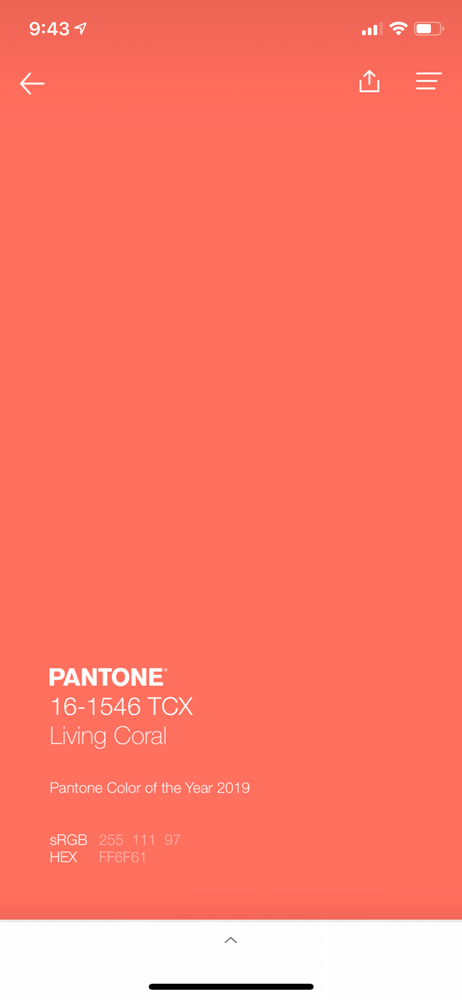
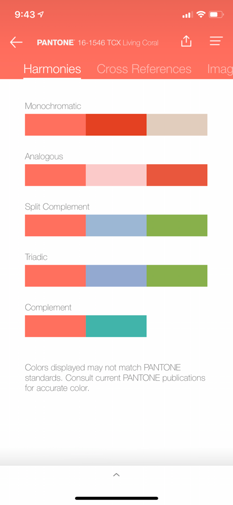
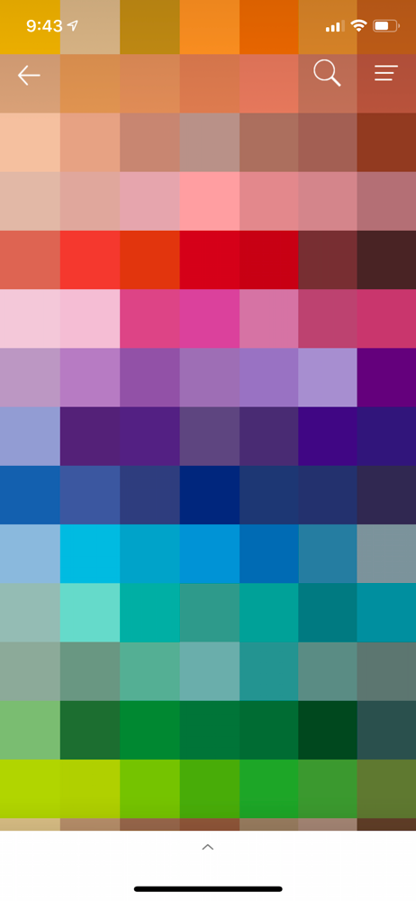
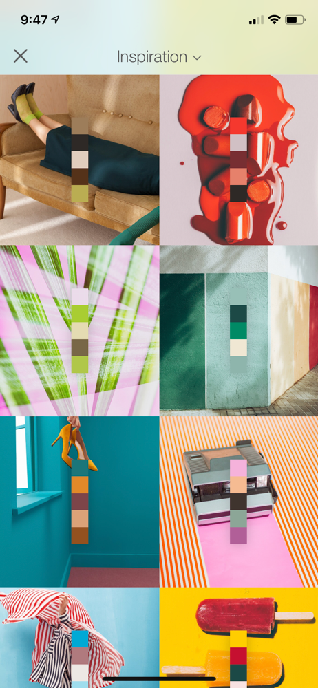
Study the product story and store experience behind the acquisition funnel.
03 / Market context
Keep revenue, downloads and store rankings separate from advertising performance.
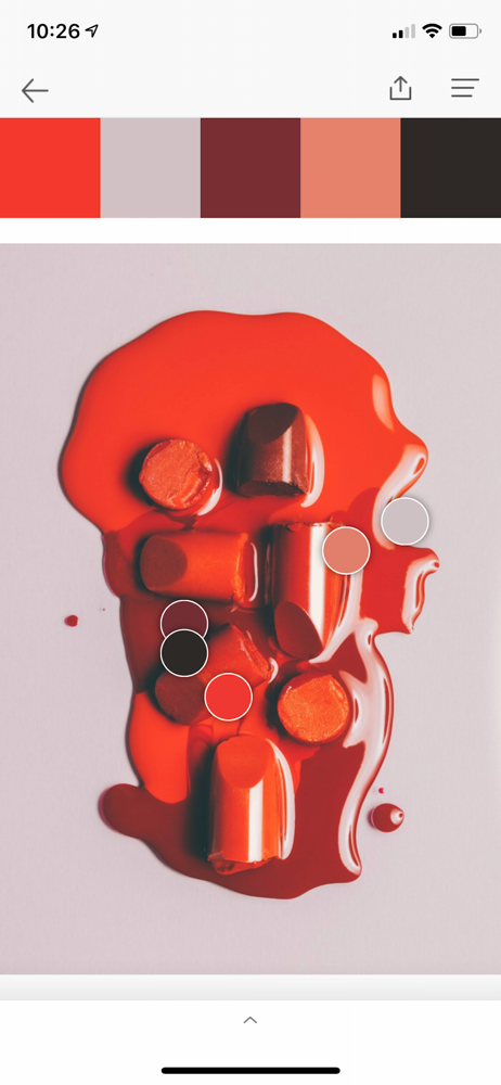
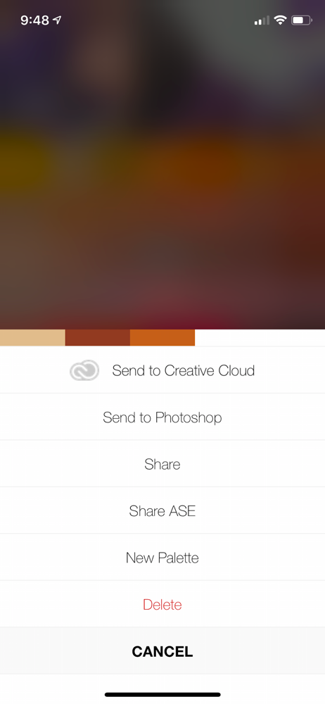
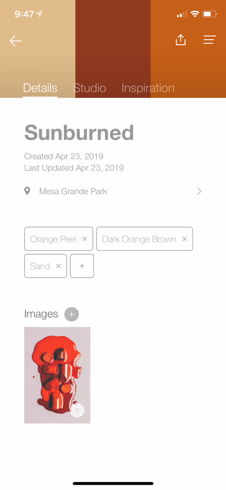
The issues I have are few. When I live stream the camera and get a color palette, taking the picture results in a different palette. Purple and green change to brown. Also, I get 5 colors and there is no way to increase that so 7 or more. I can't pick a color: that is, when the picture has red in it, the palette may not include red. I can't find a way to email a palette to someone else. I like the inspirations and the ability to enter a chip number to get the color.
I’m a graphic designer for a marketing agency and I would be lost without this app. I think working with this app and the physical copies is great for project workflow and client meetings. It’s made productivity so much better for me. It’s super easy to scroll through quickly and get the colors you’re looking for and even screenshot for quick reference later. I also do character design for a side hobby and this app works great when referencing colors for procreate when I work on my iPad. The yearly subscription is worth it if you are in any design field for a profession. I would go with the month to month subscription if you aren’t sure how often you will be using it or you can have a free week trial to get a better feel for the program itself. Having all the colors at my fingertips is such a great service Pantone put out.
Love this app so far, but when I use the image function, sometimes the color the app matches is a tiny bit different than the color in the picture. Sometime the app also suggests different colors in/around the same color area. Also what lightness level do you suggest when using this app? Colors shown on screen are different under different lightness level. What lightness level makes the color more true to the real color? Thank you for your response in advance; this app makes my design life so much easier! But color accuracy still needs to be improved.
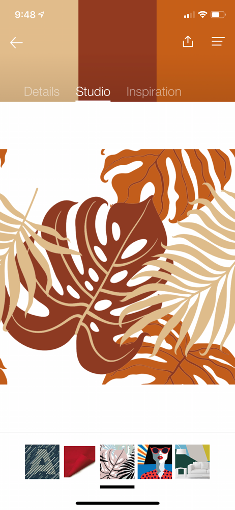
Capture your world in PANTONE Color, build and create palettes to test on 3D-rendered materials & designs, and share PANTONE Colors with your Creative...
| Name | Price | Type |
|---|---|---|
| PANTONE Studio Subscription (Monthly) | $4.99 | Monthly |
| PANTONE Studio Subscription (Annual) | $29.99 | Yearly |
| PANTONE Studio Upgrade Subscription (Annual) | $29.99 | Yearly |


