Check the acquisition promise
Read the store headline, screenshots and description. What problem is the app promising to solve?
Study the storefront ↗
NATUREWEB LLP · iOS
Explore the ad evidence, study the storefront, and build your next acquisition hypothesis.
01 / Creative research
Read the store headline, screenshots and description. What problem is the app promising to solve?
Study the storefront ↗Explore apps with direct store-link matches. Compare their hooks and formats without assuming the same approach works here.
Browse observed advertisers ↗Store rankings and revenue estimates describe market context. They do not establish ad spend, conversions or ROAS.
Review the market context ↗02 / Storefront & product
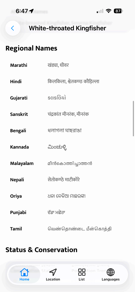
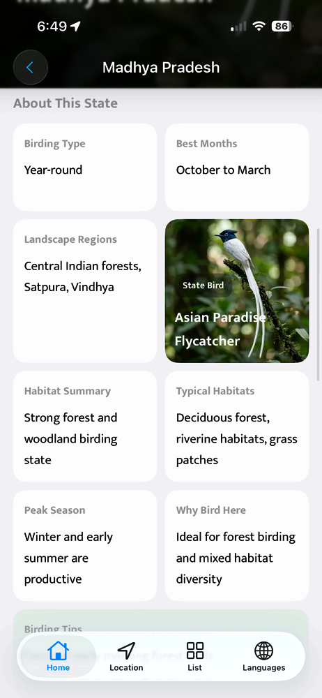
Study the product story and store experience behind the acquisition funnel.




03 / Market context
Keep revenue, downloads and store rankings separate from advertising performance.
This app seems like was made with a stock unpolished UI which was not tuned for bird watching app. The design team didn’t really understood how a bird watching app needs to be made. First of all it hardly contains data of all birds in the Indian region and then this horrid UI. Please take notes from Audubon Bird app and National Geographic’s bird app as to how to design a better app for bird watchers. I hope this app improves over time. I was looking forward to using this app but at the moment a paperback field guide is much better.
It feels like the information in the app was brought together by someone who understands and has a passion for birds but that the UX and UI was created by someone who has never been Bird watching and just threw something together. The content is great, the logo looks cool but your UX designer has destroyed your product. A couple of examples: I obviously want to use this app for bird ID: At the moment if I click on a potential bird and then go back to the main page my search is reset to the top of the list, obviously this makes searching very slow. Another: The pictures on the list are tiny and there is no way to make them larger- again, this is for identifying birds! The main thing we need here is large images to help with identifying birds. Another: the categories are very odd- for example: what category is a bee eater in this system? Stick to standard categories so your users will know where to look. Is there anyway of adding a search feature that sorts by diagnostic features? (Size, colour, habitat, etc.) it might help. There is a dearth of good apps out there, especially for India. I feel confident that people would pay for your app if it worked. I wish you the best of luck.
Indian Birds – Your Complete Birding Companion for India Explore, identify and learn about birds across India with one of the most trusted birding ap...