Check the acquisition promise
Read the store headline, screenshots and description. What problem is the app promising to solve?
Study the storefront ↗
REAPPS · iOS
Explore the ad evidence, study the storefront, and build your next acquisition hypothesis.
01 / Creative research
Read the store headline, screenshots and description. What problem is the app promising to solve?
Study the storefront ↗Explore apps with direct store-link matches. Compare their hooks and formats without assuming the same approach works here.
Browse observed advertisers ↗Store rankings and revenue estimates describe market context. They do not establish ad spend, conversions or ROAS.
Review the market context ↗02 / Storefront & product
Study the product story and store experience behind the acquisition funnel.


03 / Market context
Keep revenue, downloads and store rankings separate from advertising performance.
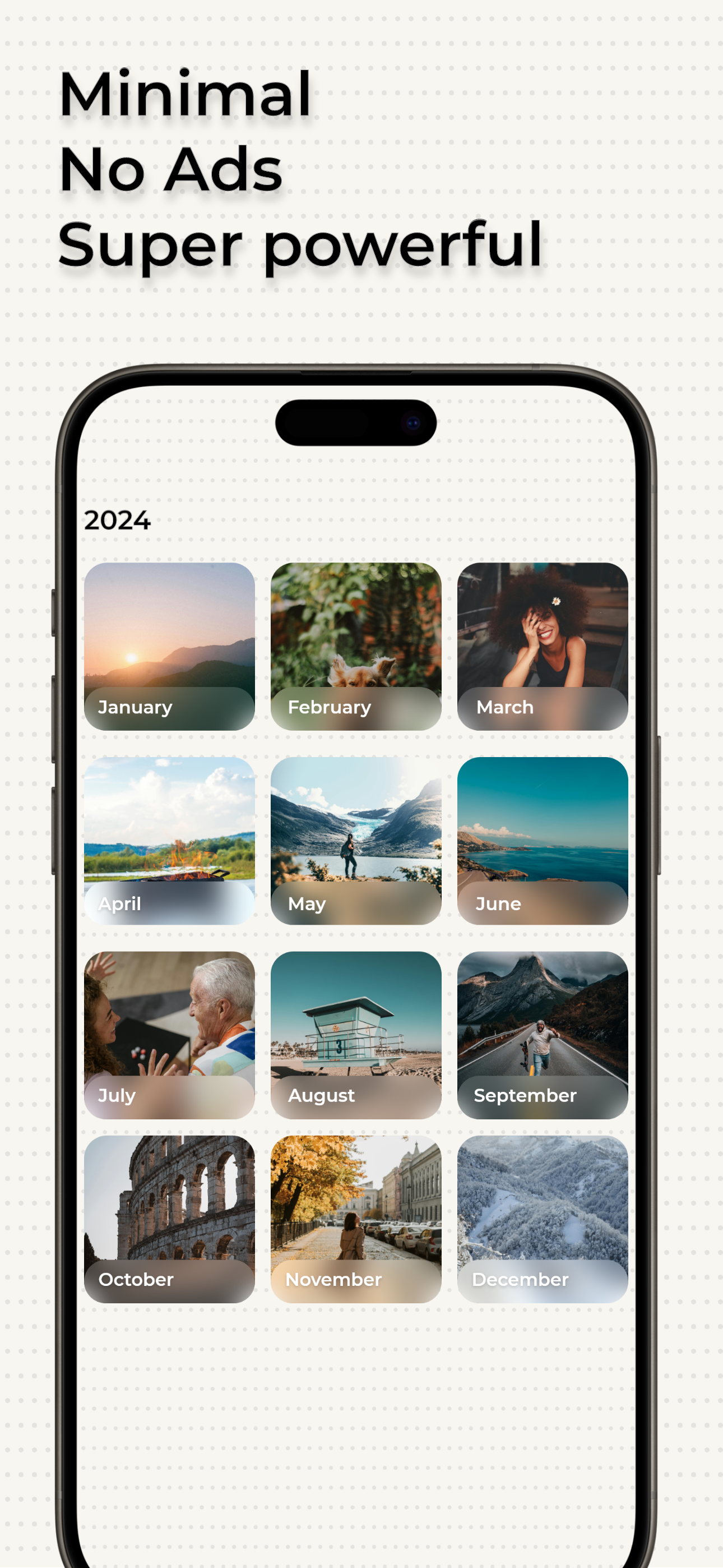
The app unfortunately doesn’t offer any way for you to test it before paying, which is odd. If you’re going to force people to pay to use it before they even see the interface, just post it as a paid app up-front. In any case, let me explain what you’re getting: You are shown monthly grouping of photos in your photo album. You tap to view one photo from that month that the app thinks you might not want to keep. You then tap to queue the photo for deletion or tap to keep it. You can also swipe forward and back through the photos until you run out of photos the app wants you to consider. Only then, or if you try to go back to the monthly grouping, are you asked if you really want to delete the photos you selected earlier. You then have to tap through to each month and repeat the process. The app is not polished yet. There are typos in the interface and the UX/UI feels like a placeholder. Why are the photos it chooses grouped by month? Why can’t you just show me each photo in a constant stream with the date listed for when the photo was taken? Why not show me some more embedded info about the photo if I want to see it so I can make better choices? Why can’t I see all of the photos you’ve decided to show me as small thumbnails in a scrolling view if I want to quickly look for photos to delete. Why can’t I multi-select small thumbnails to queue them all for deletion rather than tap through each one, one-at-a-time? Also, the UI elements at the bottom can be hard to see or read because there’s very little contrast. Put a background behind the settings, stats, etc. buttons so they stand out more. What I find really annoying is that every time you delete photos from a month, the app asks you if you like it. Stop. Follow Apple’s conventions and only prompt for a review once per version if I have the appropriate system setting selected. This app does fill a gap in the current iOS Photos app toolset, so I’m happy to give the dev some money. I also really appreciate no info is collected or used to track me. I wish more devs did that. However, this app needs some polish before it gets to 5-star status.
Saves you time and money compared to other apps
A powerful, minimal photo storage cleaner. Built and optimized for maximum speed with the singular goal of helping you free storage fast. Privacy Fi...
| Name | Price | Type |
|---|---|---|
| Photo Tap - One Time | $2.99 | One-time |
| Gallery Tap - Lifetime | $4.99 | One-time |