Check the acquisition promise
Read the store headline, screenshots and description. What problem is the app promising to solve?
Study the storefront ↗
Roberto Antonio Campusano Acosta · iOS
Explore the ad evidence, study the storefront, and build your next acquisition hypothesis.
01 / Creative research
Read the store headline, screenshots and description. What problem is the app promising to solve?
Study the storefront ↗Explore apps with direct store-link matches. Compare their hooks and formats without assuming the same approach works here.
Browse observed advertisers ↗Store rankings and revenue estimates describe market context. They do not establish ad spend, conversions or ROAS.
Review the market context ↗02 / Storefront & product
Study the product story and store experience behind the acquisition funnel.


03 / Market context
Keep revenue, downloads and store rankings separate from advertising performance.
This application really simplifies my color decision making. Prior to it, I used to struggle picking colors that go together for my projects. Now , it has become a simple process that gives great credibility to my work. Thanks developers, Take care, Espinal.
🤗...Wow!! This is the best color application! have ever seen in my life. No need to buy more books and catalogues of color. Color As Hue is all I need. Don’t worry, I will be telling all my friends about this great App. Keep up the good work, developers . I am looking to what comes next from you guys. Best of luck! Rosemary Espinal.
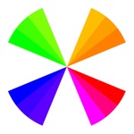
Doubtful as I am, I got this app to see if it really does what it says in the description. I know quite a bit about color and have been disappointed in the past by apps that do not deliver true useful information. After considering this app for just a few minutes, I realize that this app does indeed what it says in its description, and I would add that it does a lot more than any other color app in the market. It shows the information by sampling the color wheel: showing just what you need to learn, the concepts are presented in a concise and accurate manner. Indeed, you get to master the most advanced concepts on color matching in just a few minutes. Then, you get to see the concepts applied in real life when you switch to the area where the color schemes are. This is where the real value of the app is. It has 22 schemes of color with lots of color combinations ready to be used in any project. The themes depend on what kind of mood you would like to create. These are some of the themes: soft, friendly, romantic, energetic, classical, elegant, and more. Moreover, the amount of information that this app contains in less than 2 megabytes of memory is truly remarkable. In my estimation, it is the equivalent of at least 2 books of color. This is great work. I whole heartedly recommend this app to anyone who has a need to use colors for any project out there: professional or amateur. 👏🌏✔️
It is a well known fact that color affects our mood, making us feel: cheery, happy, sad, energetic, elegant, calm, etc. Unfortunately, our memory, whe...